OpenAI Changes Up ChatGPT Interface

As part of the continuing rollout of their products in testing, OpenAI has refined the ChatGPT web interface incrementally. Here’s what it looks like now: The single drop-down box has been replaced with two buttons, one for GPT 3.5 Turbo ...

By Daniel Detlaf

One-man flea circus, writer, sci-fi nerd, news junkie and AI tinkerer.

Pssst. Would you like a quick weekly dose of AI news, tools and tips to your inbox? Sign up for our newsletter, AIn't Got The Time.

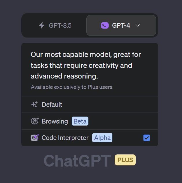
As part of the continuing rollout of their products in testing, OpenAI has refined the ChatGPT web interface incrementally. Here’s what it looks like now:
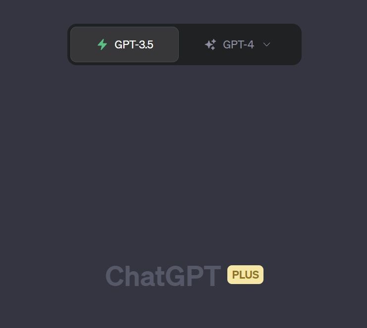
ChatGPT new Interface

The single drop-down box has been replaced with two buttons, one for GPT 3.5 Turbo and one for GPT-4.

OpenAI has been expanding access to plugins lately, with many users reporting the Browsing or Code Interpreter variants were made available to them recently. If you’re still on the waitlist, hold on!

Create an amazing adventure with Storynest.ai. Try it free.  - Sponsored

Sponsored